THANK YOU!!!
A big thanks to everyone who helped us reach and surpass our goal on INDIEGOGO. Your donation are much appreciated and will help us to put together our pilot 'animatic'!
The MonstroCity High blog is now public - so please enjoy all the MCH development since it's inception in 2005 - from the making of the vinyl figures to concept art to test animation, interviews and sad attempts at me trying to write the theme song.
Although we DID reach our funding goal it is still at an early stage and we will hopefully have a NEW revised page at INDIEGOGO with a NEW goal and a load of NEW vip perks and opportunities for fans to get involved. So stay tuned and once again...
THANK YOU!
THEME SONG LYRICS...
Mom's and Pop's should warn their kids,
about weird junk that shouldn't mix.
about weird junk that shouldn't mix.
Like cats and dogs and flies and frogs
And monster-human cliquey clicks.
The earth has torn, it's open wide,
it swallows the petty rivals inside.
Their two worlds are in these halls,
trapped inside these stitched up walls.
Do or die in MostroCity High,
and after all be ready to
Try and fight in MostroCity High,
to make it work and live as one
inside a school that might be fun.
Poses...
Getting your character comps into a new pose is relatively easy. I start by dropping my comps onto the stage and size them according to the scenes specs.
I then take a look to see what parts of the characters need to be reposed and break those elements down and roughly position them into the desired pose in the storyboard.
Then I draw the revisions with the comps underneath as a guide. This ensures that the models will stay roughly to scale.
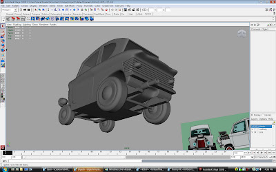
3D Help?
Here's a great scooter that was started for the project. If anyone out there knows how to 'toon render' this puppy, I'd love your help.
Direction Notes...
So scenes have started to come in. I asked alot of you to do 'custom' posing for your scenes and I hope that isn't causing too many headaches - but I do think it's important to 'draw' the characters, or their parts when need be.
Here's a scene that I made some design notes on. So, no worries if your drawings aren't perfectly on model - I will help get you there.
MCH - SEQ. 06 (W.I.P)
Later in the series, Crush transforms his beater car into a hotrod to race Chaz. I posted these before but felt it was relevent to post them again.
Here's a simple parking lot BG. I typically color in flash, then take the image into photoshop and adjust the colors till i'm happy. I then bring it back into the vector based flash program and eye dropper the new colors onto the image. I find I can keep the image free from aliasing this way.
~CLICK~
Above is a small sc. within this seq. staring Pit, Cherri Berry's 'not so twin' twin sister with a rough car guide for ref.
Above is a small sc. within this seq. staring Pit, Cherri Berry's 'not so twin' twin sister with a rough car guide for ref.
This sequence is a bit bigger and will take longer to do, so I'll post it up a little at a time so the old blog doesn't sit idle.
Above: I've pieced together some of the board panels to get a full shot of the layout. This will be the rough guide I'll need for the background art.
Storyboard panels: Ted Collyer
MCH - Test Sc.05
I had alot of fun posing out this scene. Not the best animation in the world...but I never claimed to be an animator, so get off my back man!
Voice of Kent: Sean Cookson
Kent Design: Steve Lambe
MCH - Test Scene 04
Still waiting to hear back from the network... Either way, I'm having tons of fun animating these little test scenes.
Voices: Chaz - Christian Potenza, Cherri - Deanna Marsigliese.
Another MCH Test Sc...

Here's another test sc. for MonstroCity High. I've been choosing simple scenes to start cuz there relatively easy to get through. Next I'd like to tackle a scene with a bit more action in it.
We'll be talking with a network later today about going to series with this, so....cross yer fingers for us.
Voices: Harry - Mark Ackland, Crush - Ted Collyer
MCH ANIM TEST...

Thanks to Ted Collyer (Clone High Director) who voiced Crush and Deanna Marsigliese (Author, illustrator of The Art of Deanna Marsigliese) who is the voice of Cherri. Great job guys.
A BIG THX...
I wanted to give a huge shout out to Lisa Jones, Curtis Lelash and Khaki Jones over at Cartoon Network. These are the 3 amazing exects who were championing our show for the past 6 months.
Mark and I just wanted to make sure you knew how much we appreciated the (very) short time we worked together while developing Monstrocity High. The supportive collaboration we got from the team at Cartoon Network is something we don't experience too often.
Mark and I just wanted to make sure you knew how much we appreciated the (very) short time we worked together while developing Monstrocity High. The supportive collaboration we got from the team at Cartoon Network is something we don't experience too often.
It was very refreshing to have discussions with people who "get it", and who choose to encourage and support creators rather than micro-manage them and force ideas of what their show "should be".
Thank you for believing in our show and us as creators with a unique vision.
Thank you for believing in our show and us as creators with a unique vision.
MonstroCity High...
Subscribe to:
Posts (Atom)


